Build Together: Southeast Wyoming Brand Design
A brand kit created for Build Together: Southeast Wyoming, a regional initiative focused on community development and economic growth in Wyoming's southeast corridor.
Build Together: Southeast Wyoming is a NextGen Sector Partnership with a community-driven focus bringing together contractors, businesses, schools, and local agencies around the construction industry in Laramie County. When they came to me, they had a name, a mission, and some early sketch concepts. What they needed was a full identity system that could carry the brand forward as the organization grows.
View the full brand kitFinding the right direction
The brief called for something that balanced construction and industry with Wyoming identity and a bit of personality. The design direction pulls from the visual language of the trades such as steel, structure, precision while making sure it doesn't feel like a corporate hard hat manual. The goal was something contractors and community members alike would feel proud to put their name behind.
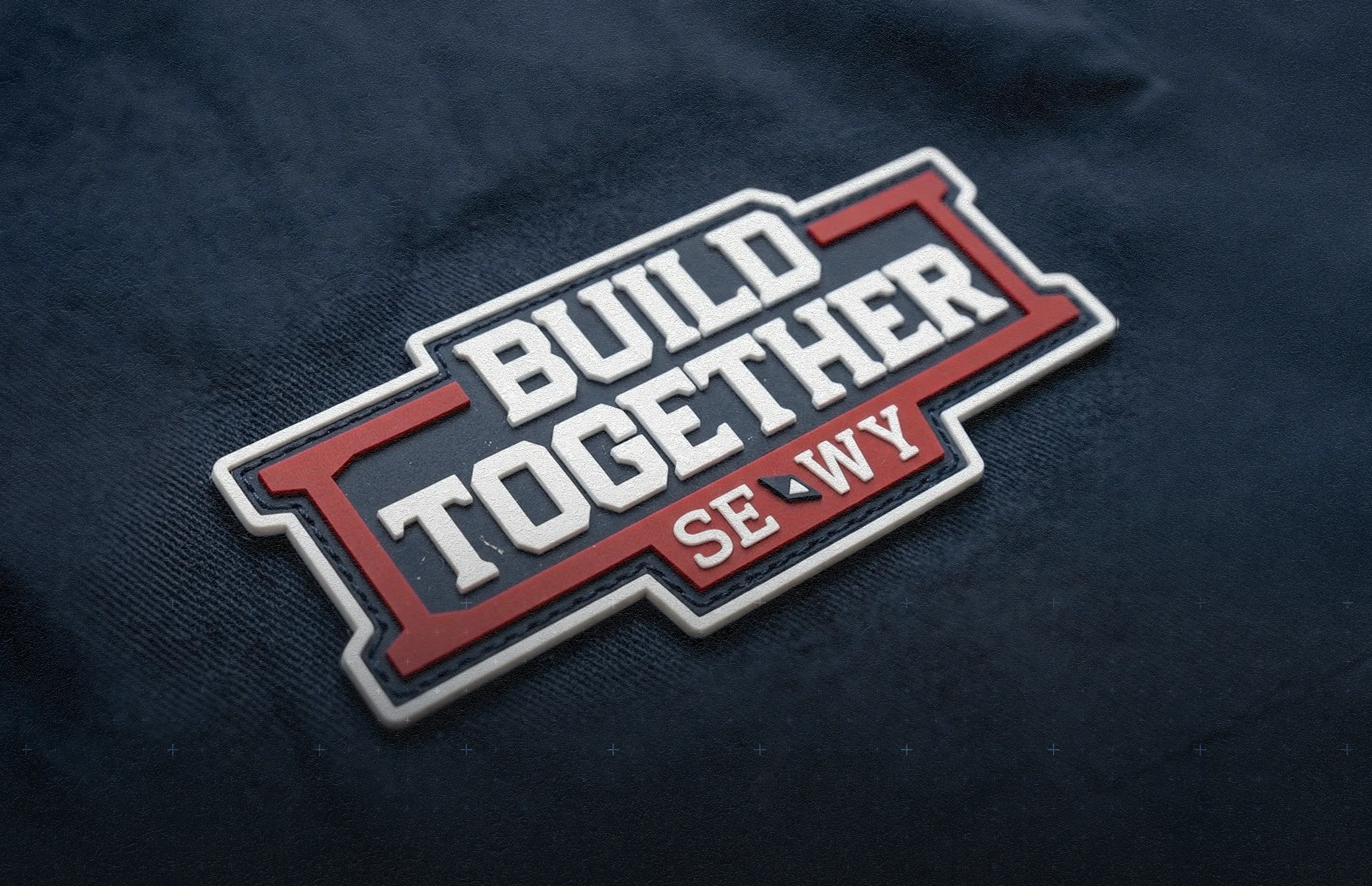
The primary logo
The centerpiece of the identity is an I-beam wordmark, where the structural form of the I-beam is built directly into the letterforms. It's a simple concept, but it does a lot. It ties the name directly to the construction industry without being heavy-handed about it, and it holds up well across different sizes and applications.
The secondary mark
The secondary logo takes a more regional angle. It's a compass rose built around I-beam geometry and layered with Wyoming-specific design elements, referencing both the Southeast Wyoming geography and the partnership's sense of purpose and direction. It gives the brand a second visual option that works well in contexts where the full wordmark is too much.
Custom typography and brand documentation
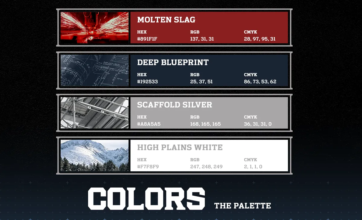
To give the identity some real depth, I developed a custom typeface designed to complement the character of the marks. The full brand proposal also included a thoughtfully built color palette, clear usage guidelines, and detailed documentation explaining the thinking behind each design decision.
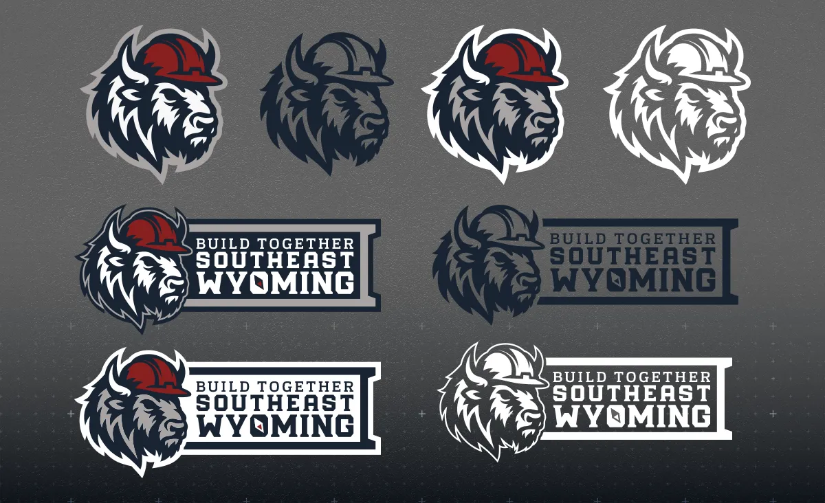
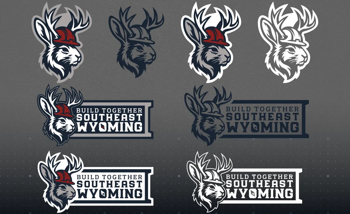
The mascots
I knew early in the process, that I wanted something in the brand kit that people would actually put on a water bottle or a hard hat, something with a little life to it. That turned into two mascot marks: a bison and a jackalope. Both are distinctly Wyoming, both have enough personality to stand on their own, and both work as flexible brand assets outside of the formal logo system. There is a subtle 'WY' built into the neck of the bison.